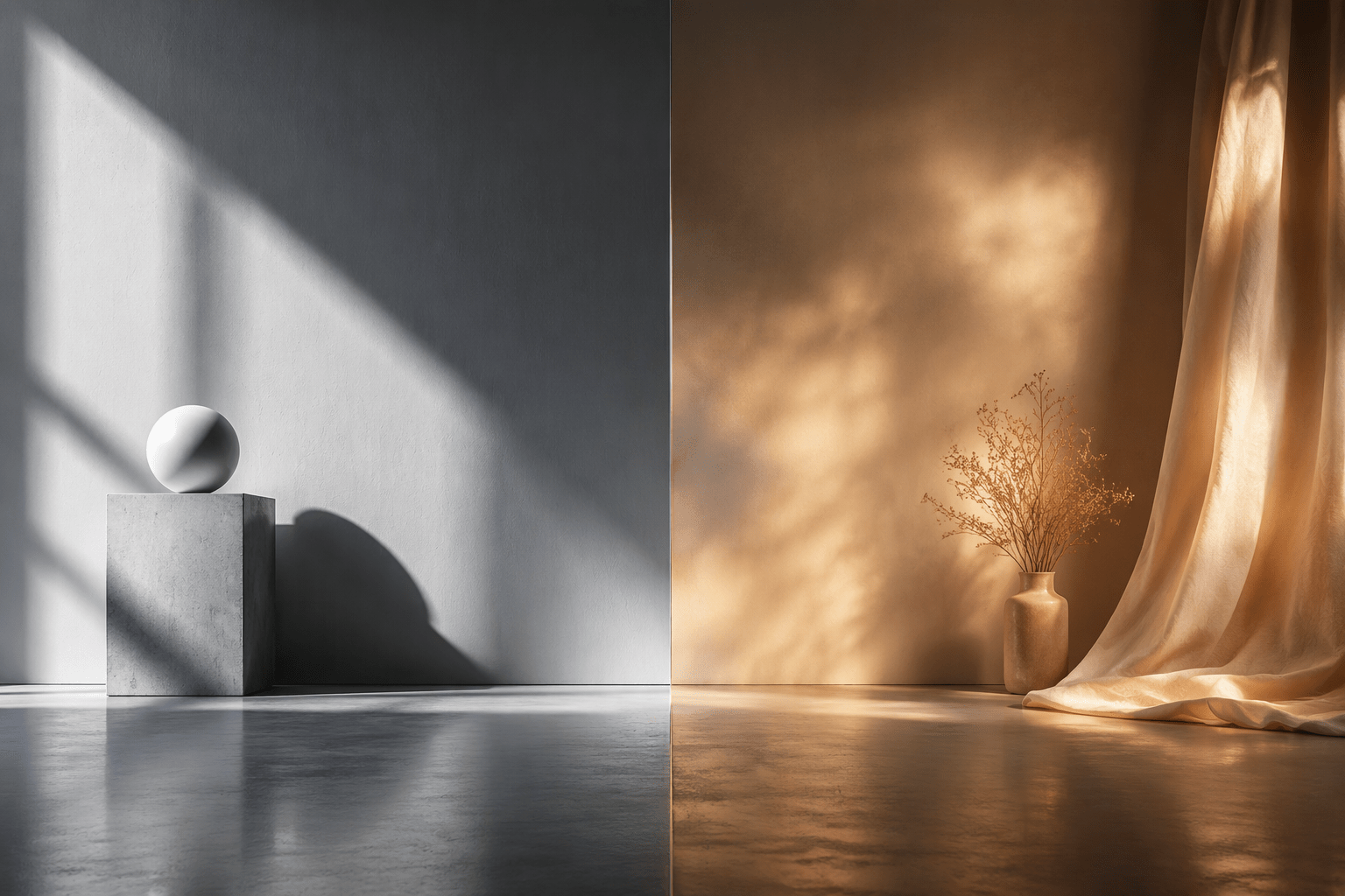

GPT Image 2 vs Stable Diffusion 3.5 is an argument usually made by people who have not run both models side by side. They summarise release notes, quote benchmarks, and never show you a single render. So I ran an actual test: five prompts, sent identically to two models, no cherry picking, no reruns except one I will explain below.
Need a Director for Your Next Project?
From commercials to branded campaigns—Olivier brings creative vision and technical expertise.
→ View ProjectsThe two models are GPT Image 2 from OpenAI and Stable Diffusion 3.5 Large from Stability AI. Every image below came out of that test. Nothing here is a press asset or a stock photo.
The short version: GPT Image 2 executes the brief. Stable Diffusion 3.5 interprets the mood. Both are useful, and knowing which is which will save you a lot of wasted credits. For the wider picture, our AI prompting and image generation hub collects everything we have tested.
How the test was set up
Five prompts, each targeting one thing that actually matters in production work: legible text, hand anatomy, skin under specified lighting, multi-subject staging, and adherence to a graphic format.
Each prompt went to both models as written, character for character. Same aspect ratio, 1024 by 1024. First result kept in every case. No negative prompt fields, no seed hunting, no upscaling.
One exception on transparency: the poster test was run twice. The first version of that prompt caused GPT Image 2 to invent a cast list of real actors and a real director for a film that does not exist, which is not something worth publishing. The prompt was rewritten to request title text only, and both models were rerun on the new prompt. That rerun is the pair shown below. The original outputs were discarded for both models, not just one.
Test 1: Text on a sign
The prompt asked for a weathered enamel shop sign reading STUDIO SUPREME in bold condensed capitals, mounted on brick, overcast daylight, 35mm photograph.
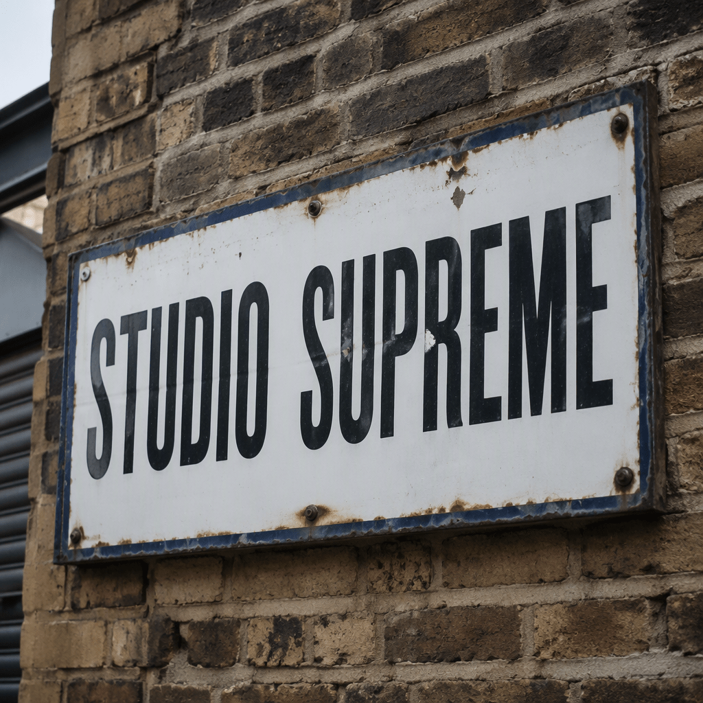
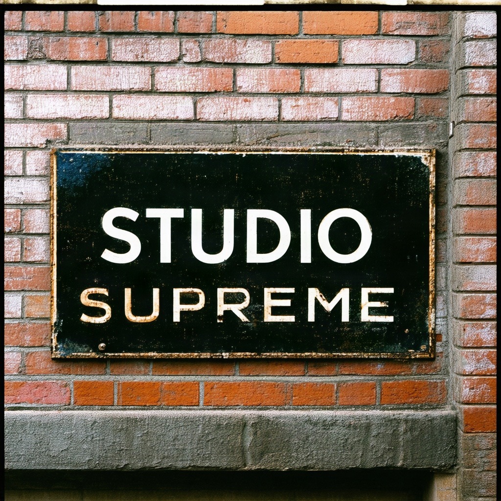
Both models spelled it correctly. That is worth stating plainly, because the internet still repeats that Stable Diffusion cannot render text, and this test does not support that.
The difference is in the brief. The prompt said bold condensed capitals. GPT Image 2 delivered exactly that, on one line, with consistent letterforms, believable enamel chipping and rust at the fixing points. Stable Diffusion split the words onto two lines and set them in two visibly different typefaces at two different weights, neither of them condensed. The sign is attractive. It is not the sign that was asked for.
Test 2: Hands and fine detail
The prompt asked for a close up of two hands tying a fishing knot with thin monofilament line, shallow depth of field, natural window light, editorial photography.
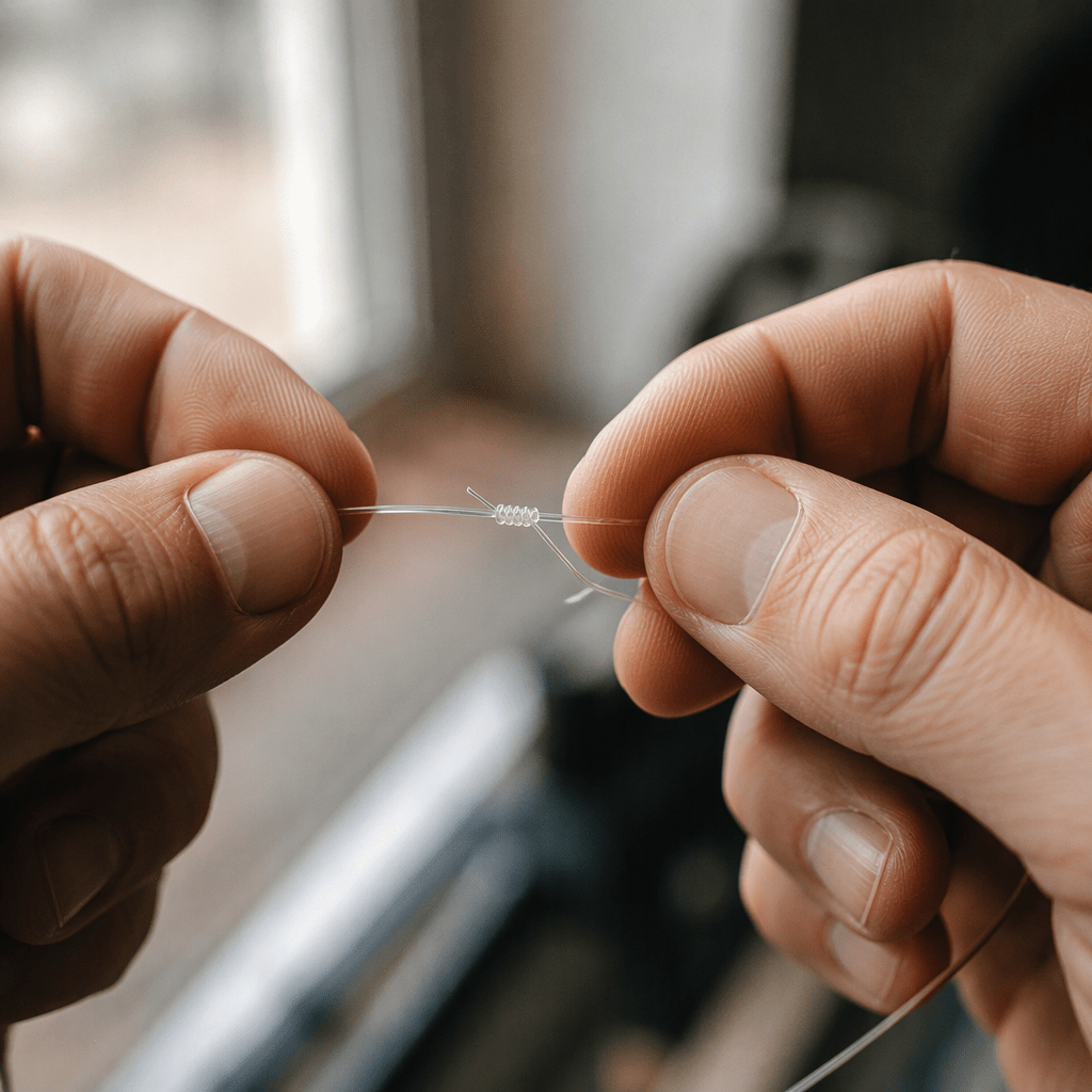
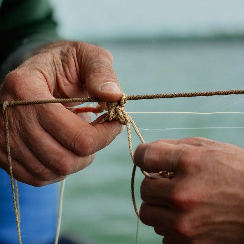
Hands used to be the standard way to catch an AI image. Neither model produced the six-fingered horrors of two years ago, so that test is retired. We reached a similar conclusion in our earlier AI art tool comparison.
What separates them is again specificity. The prompt said thin monofilament. GPT Image 2 rendered clear, almost invisible line with a coiled knot actually forming between the fingers. Stable Diffusion rendered thick brown rope, which is a different material doing a different job. Look closely at the lower left hand in the Stable Diffusion frame and the finger separation gets ambiguous where two digits meet.
Test 3: Skin and photorealism
The prompt asked for a head and shoulders portrait of a 60 year old fisherman, deep skin texture and pores, grey stubble, soft north-facing window light, 85mm lens, photorealistic.
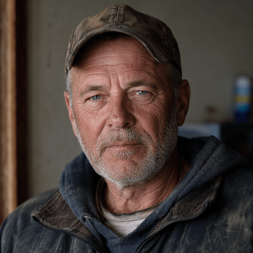
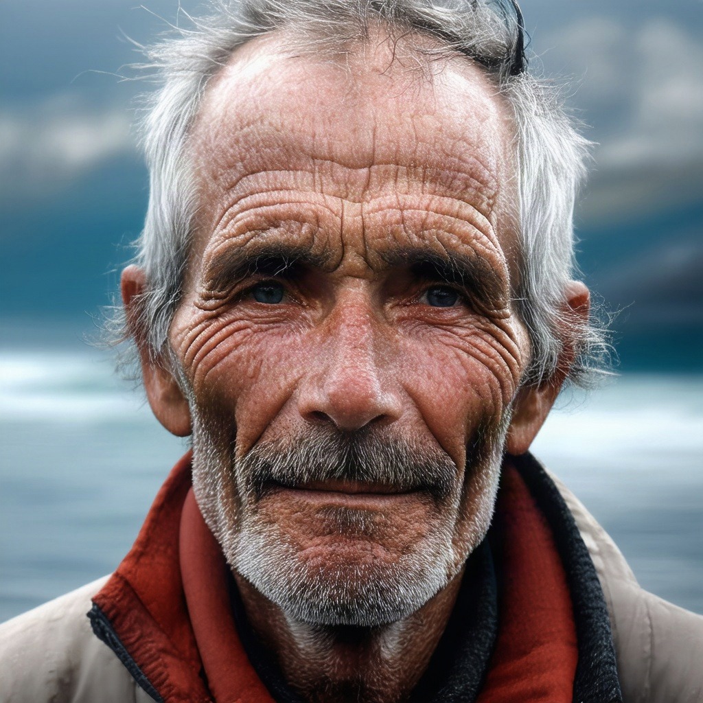
This is the closest result of the five, and the one where Stable Diffusion competes hardest. Its wrinkle and pore rendering is more aggressive than GPT Image 2 output, and as a piece of portraiture it is arguably the stronger image. If you are chasing weathered character, it delivers.
It also ignored the lighting brief. Soft north-facing window light means indoors, one directional soft source. Stable Diffusion put the man outdoors against open water under ambient daylight. GPT Image 2 kept him inside with a soft key from frame left and a believable 85mm compression on the features.
So even where Stable Diffusion craft competes, it drifts off spec. That pattern is the whole story of this test.
Test 4: Multi-subject composition
The prompt asked for three chefs working at separate stations in a busy restaurant kitchen, steam, motion, wide shot, one chef plating in the foreground, documentary photography.
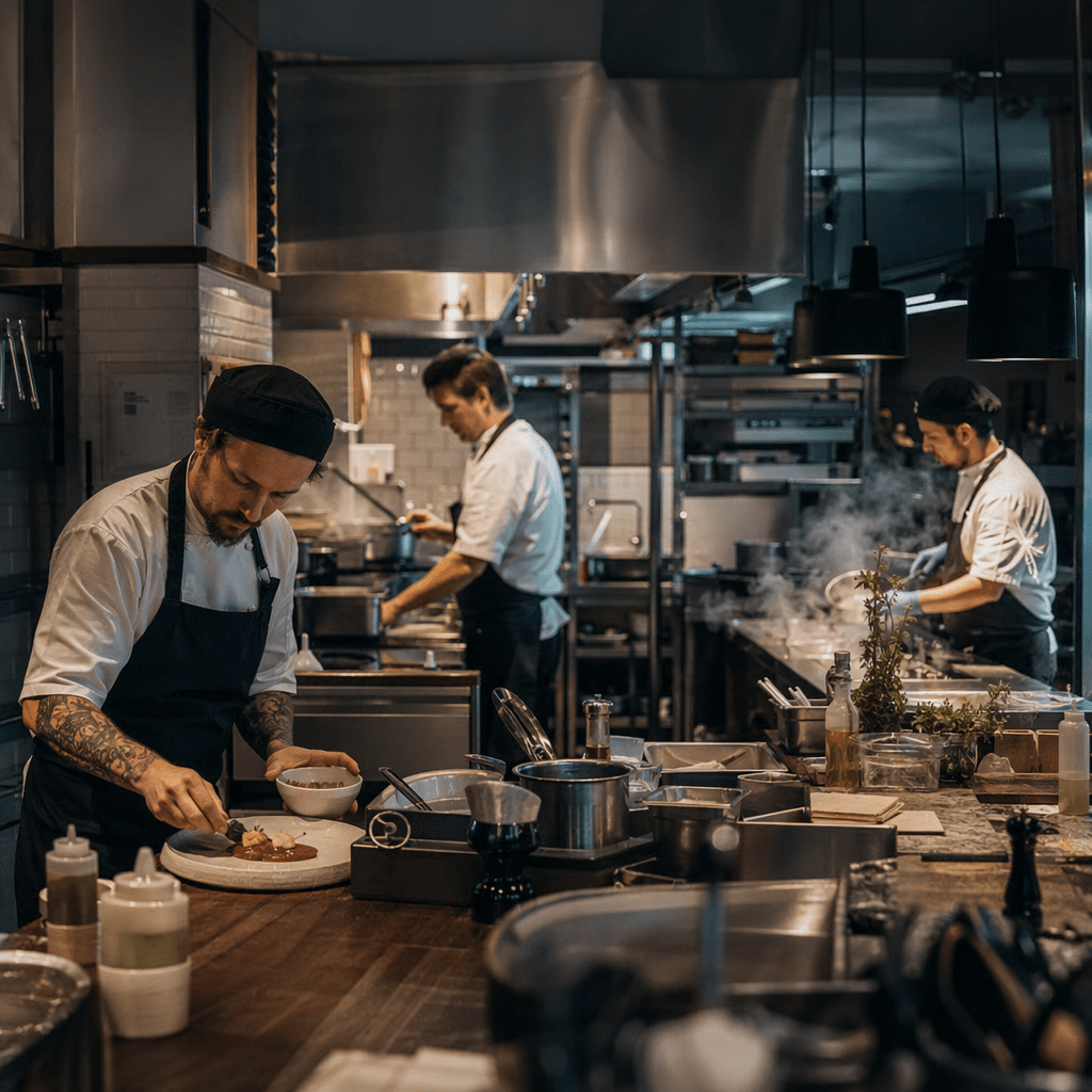
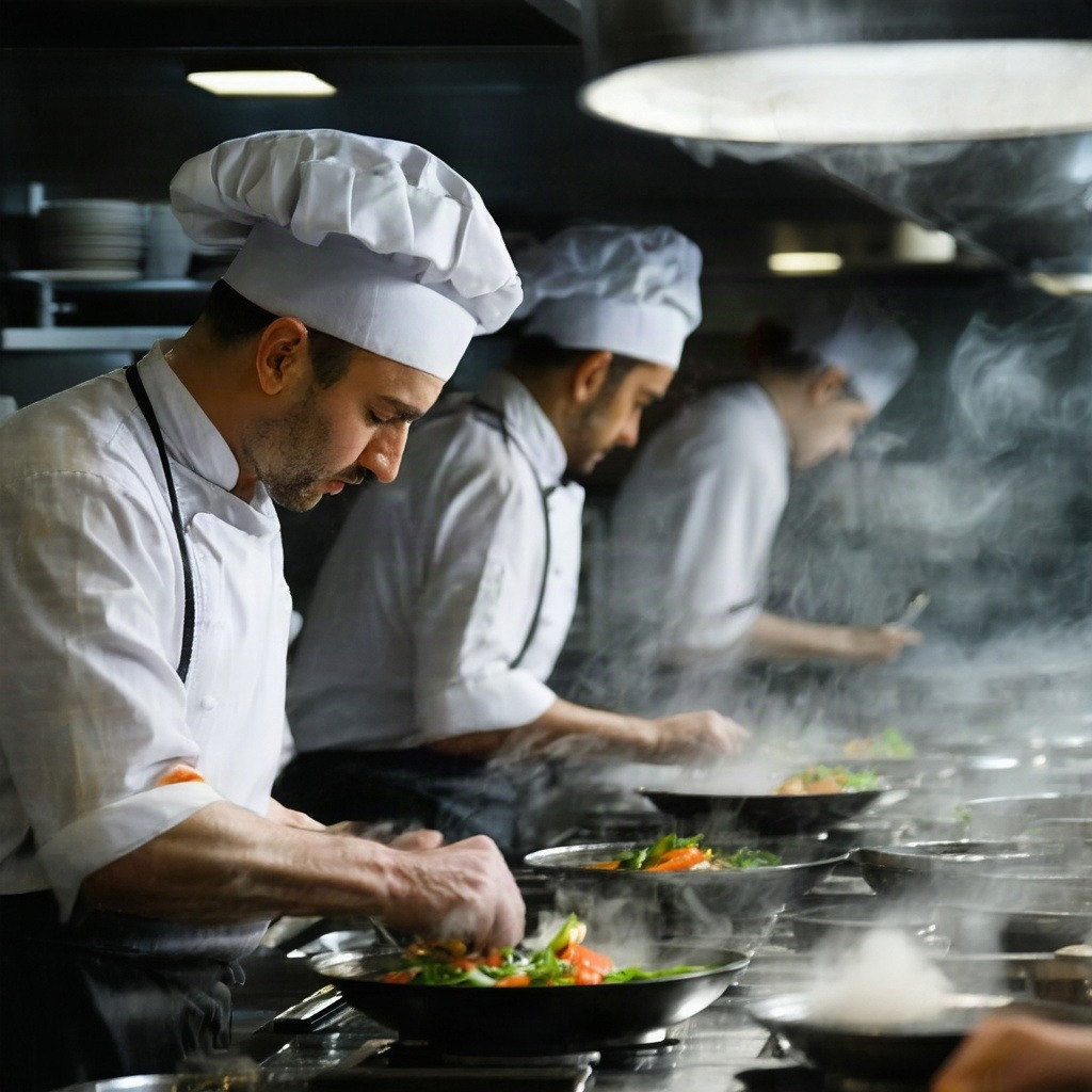
This prompt had four separate spatial instructions: three subjects, separate stations, wide shot, and one specific action in the foreground.
GPT Image 2 hit all four. Three chefs, genuinely separated in depth across the room, a wide framing that reads the space, and the foreground chef plating a dish with tweezers.
Stable Diffusion lined its chefs shoulder to shoulder along a single pass, which is one station rather than three. The foreground chef is tossing a wok, not plating. The framing is closer than a wide shot. It also reached for tall white toques, the costume-shop version of a chef, where GPT Image 2 used the skullcaps and aprons you actually see in a working kitchen.
The Stable Diffusion image has better light. It is also not the shot that was ordered.
Test 5: Style and format
The prompt asked for a 1970s Italian film poster, screenprint illustration of a lone motorcyclist on a coastal road, flat limited four colour palette, heavy paper grain, with the title IL VENTO ROSSO in bold condensed capitals across the upper third. It explicitly said no cast list, no actor names, no director credit, no studio logos, no small print of any kind.
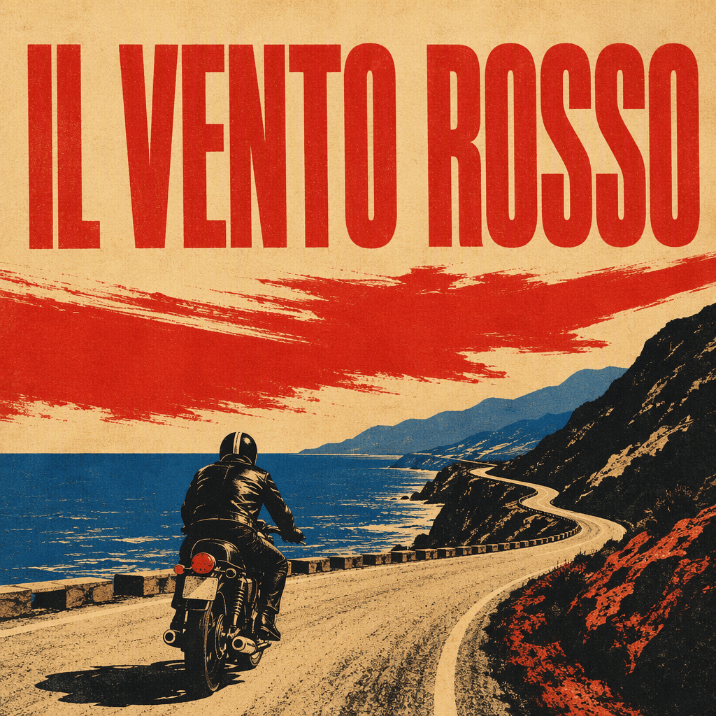
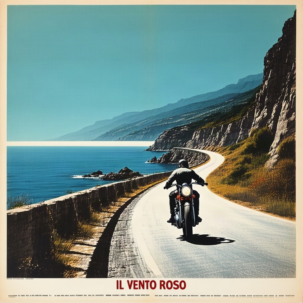
This is the widest gap in the test.
GPT Image 2 produced a poster. Title correctly spelled, bold condensed capitals, upper third as specified, flat four colour separation, heavy paper grain, and nothing else on the page.
Stable Diffusion produced a photograph with a caption. The title sits at the bottom rather than the top, small rather than large. It reads IL VENTO ROSO, one S short. And along the bottom edge it added a block of illegible fake small print, which is precisely what the prompt forbade.
That last point is the most useful thing in this entire test. Negative instructions inside a positive prompt are a known weak spot for diffusion models. Telling Stable Diffusion not to include something can make it more likely to appear, because the tokens are still in the conditioning. GPT Image 2 handles the same instruction as an instruction.
It also revises the text finding from Test 1. Stable Diffusion can spell when the text is the subject of the image. When text is secondary, it degrades into misspelling and invented small print. Unreliable rather than incapable, which is a meaningful difference if you are planning a shot around it.
GPT Image 2 vs Stable Diffusion 3.5: the pattern
Across five prompts the split is consistent. GPT Image 2 treats the prompt as a specification and works down the list. Stable Diffusion 3.5 treats the prompt as a description of a feeling and paints toward that feeling, dropping constraints along the way.
Count the misses. Stable Diffusion missed the typeface brief, the material brief, the lighting brief, the staging brief, and the format brief. In every one of those cases it produced a competent image that answered a slightly different question.
That is not a bug so much as a different design philosophy. Diffusion models optimise for plausible images. Instruction-following is a separate capability, and GPT Image 2 has clearly been trained hard on it.
Which one to reach for
Use GPT Image 2 when the image has to match something outside itself: a storyboard the director already approved, a brand typeface, a specific lens and lighting setup, a layout with type on it, a scene with a defined number of people doing defined things. Anything where being wrong costs a revision round.
Use Stable Diffusion 3.5 when you are looking rather than specifying. Mood boards, texture plates, lighting references, early concept exploration where the point is to be surprised. It also pairs well with AI image enhancement in post-production. It is also open weights, which means local running, fine tuning on your own material, and no per-image cost once you have the hardware. For a studio building a house style on proprietary reference, that matters more than any single render in this article.
The honest summary is that GPT Image 2 won this test because this test measured instruction adherence. Run a test that measures aesthetic surprise and the result would likely flip. If you want a third option in the mix, see what the Nano Banana AI tool does.
Reproducing this yourself
Every prompt used here is plain English and none of them are clever. If you want to check the results, paste them into both models and see what you get. Your renders will differ, because these are stochastic systems and nothing here was seeded.
That is the point of running your own tests rather than reading someone benchmark table. Five prompts and twenty minutes will tell you more about which model fits your work than any spec comparison, including this one.
Discover more from Olivier Hero Dressen Blog: Filmmaking & Creative Tech
Subscribe to get the latest posts sent to your email.

Work with Olivier
Director | CD | DP & Photographer
Specializing in commercials, music videos, AI-driven filmmaking, and cinematic storytelling for brands and production companies.
🌍 Shanghai · Paris · Los Angeles · Dubai
🎬 View Portfolio & Get in Touch