

Key Takeaways
- First insight: Mastering y2k style in AI prompts requires understanding its core visual grammar: metallic gradients, translucent plastics, low-resolution digital textures, and early-2000s consumer electronics.
- Craft highlight: The most effective y2k style prompts combine specific material keywords (chrome, frosted polycarbonate, CRT scan lines) with era-accurate lighting conditions like overhead fluorescent or direct flash.
- Industry context: As of July 2026, the y2k aesthetic has evolved from a niche nostalgia trend into a mainstream production requirement for fashion campaigns, music videos, and brand storytelling across agencies worldwide.
- Bottom line: This guide delivers a practical, repeatable framework for generating consistent y2k style results across AI tools like FLUX, Midjourney, and Nano Banana, with specific prompt templates you can adapt today.
The y2k style has officially moved beyond nostalgia into a core visual language for filmmakers, designers, and brand strategists in 2026. What started as a retro curiosity on social media is now a deliberate production choice. Inside our studio pipeline, we see briefs requesting y2k aesthetic treatments for luxury fashion campaigns, tech product launches, and even corporate rebrands. The challenge is consistency. Generating a single convincing y2k image with AI is easy.
Need a Director for Your Next Project?
From commercials to branded campaigns—Olivier brings creative vision and technical expertise.
→ View Projects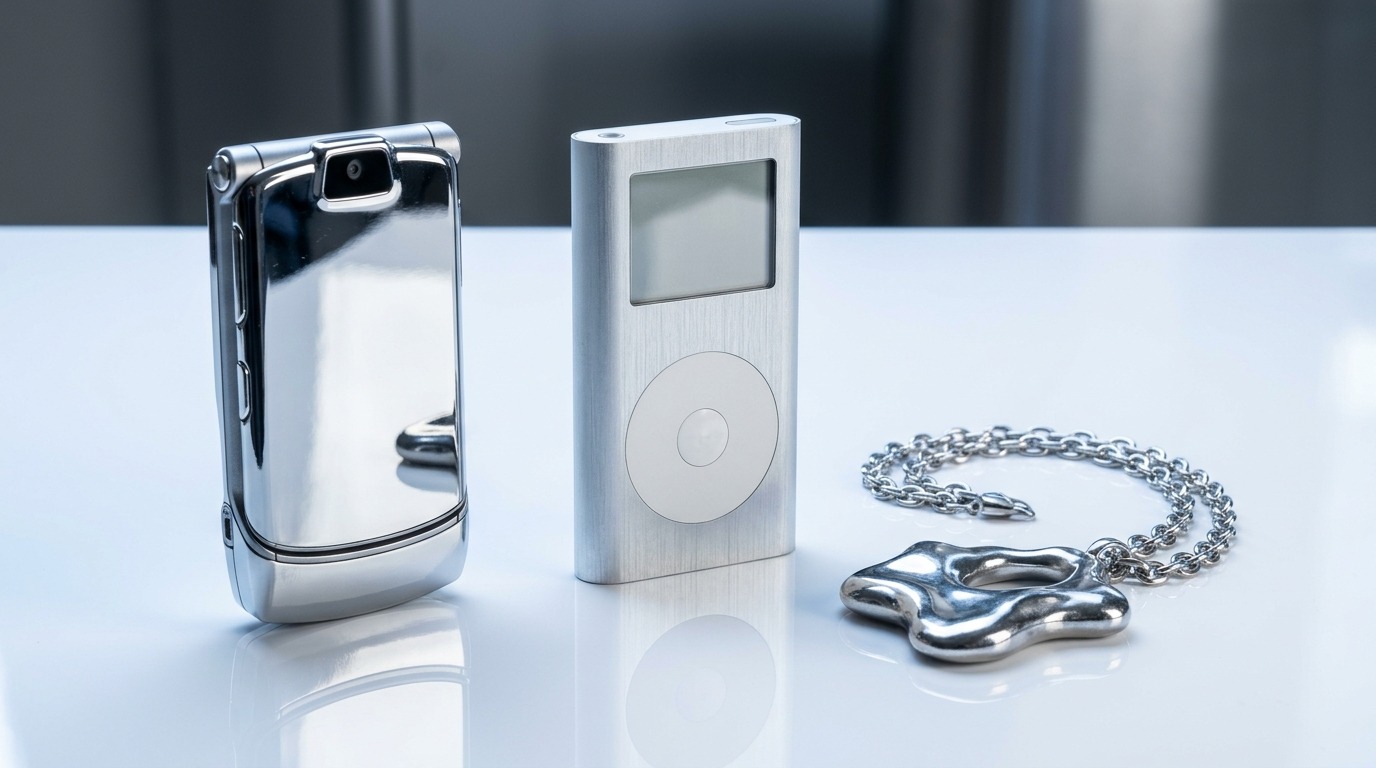
Generating a coherent series that feels authentic and not like a glitchy mess is the real craft. This guide breaks down the five essential pieces you need to master y2k style prompts, with templates and techniques drawn from real production work.
The Metal and Chrome Foundation
Every convincing y2k style image starts with chrome. Not brushed steel or matte aluminum. Chrome. The highly reflective, almost mirror-like finish that dominated early-2000s product design, from Nokia phone cases to Sony Discman lids. In prompt terms, chrome is your anchor material.
Olivier, who directs brand films for clients like Nike and Cartier, puts it this way. “Chrome in y2k is not about luxury. It is about futurism filtered through cheap manufacturing. The shine is aggressive, not elegant.” That distinction matters when you write prompts. Avoid words like “polished” or “luxurious.” Use “high-gloss chrome,” “specular reflection,” “mirror finish.”
A solid base prompt looks like this: “A chrome-finished portable CD player on a translucent blue desk, high-gloss reflective surface, strong specular highlights, overhead fluorescent lighting, product photography style, shallow depth of field.” This gives the AI a clear material target without abstract adjectives.
Combine chrome with a second material for depth. The classic y2k pairing is chrome plus frosted polycarbonate. Think of the iMac G3 or early 2000s computer peripherals. Your prompt becomes: “Chrome and frosted polycarbonate handheld device, Bondi Blue accents, glossy plastic buttons, bright direct flash, flat lay composition.”
For broader scenes, use chrome as an accent. A room with chrome furniture legs, a chrome lamp, or chrome trim on electronics grounds the image in the period without overwhelming the composition. The key is specificity. Do not write “retro tech.” Write “silver chrome portable DVD player with translucent green casing.”
Our testing across FLUX.2 and Midjourney shows that chrome renders most reliably when you include a secondary reflective surface in the frame. A mirrored tabletop, a glass screen, or a polished floor doubles the chrome effect. The AI uses the reflection to reinforce the material property.
One warning. Chrome can tip into science fiction if you are not careful. The difference between y2k chrome and generic sci-fi chrome is context. Add a cord. Add a button with a visible label. Add a sticker or a logo. These small imperfections signal consumer electronics, not a spaceship. You can see examples of this technique in the authentic y2k photo guide we published earlier this year.
Translucent Plastic and Ices
If chrome is the skeleton of y2k style, translucent plastic is the skin. The early 2000s were obsessed with see-through materials. The iMac G3 in Bondi Blue, the Game Boy Color in Atomic Purple, the countless clear landline phones and alarm clocks. Translucency signaled modernity and a kind of playful transparency that felt futuristic at the time.
In prompt terms, you need to specify both the material and the color. “Translucent blue polycarbonate” works better than “see-through blue.” “Frosted ice gray” is more precise than “clear plastic.” The AI needs a material reference because translucent plastic has specific optical properties: light scatters through it, edges glow, internal components are vaguely visible.
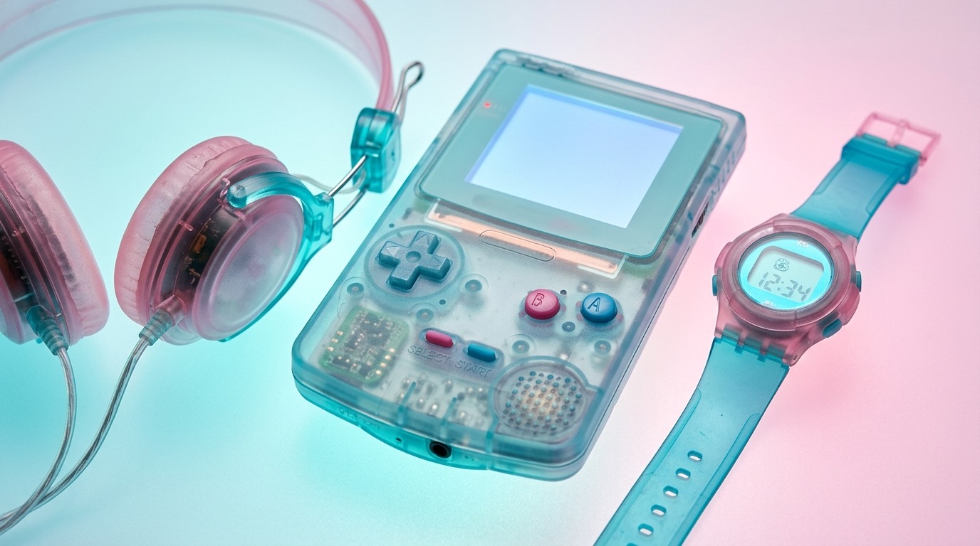
Here is a reliable template. “A translucent [color] polycarbonate [object] with visible internal circuit board traces, soft edge glow, frosted finish, placed on a white glossy surface, direct overhead flash, product photography, shallow depth of field.” The “visible internal circuit board traces” is the key detail. It forces the AI to render translucency with internal structure, not just a colored glass effect.
Color choices matter for era accuracy. The canonical y2k translucent colors are Bondi Blue, Atomic Purple, Ice Gray, Lime Green, and Orange. Avoid pastels. Y2k colors were saturated and slightly harsh. Think Gatorade bottles, not Easter eggs. You can find a full palette breakdown in the y2k aesthetic prompt collection.
For scenes with multiple translucent objects, vary the colors but keep the material consistent. A desk with a clear blue phone, a green pencil holder, and a gray monitor creates a cohesive palette. The translucency ties them together visually even when the colors clash.
A common mistake is using “glass” instead of “plastic” in prompts. Glass has different refraction and reflection properties. It looks fragile and premium. Y2k plastic looks durable and cheap. The difference is subtle in a single image but obvious in a series. Glass images feel like high-end perfume ads. Plastic images feel like a 1999 electronics catalog. Choose your target and stick with it.
One advanced technique is layering translucent plastic over chrome. A chrome device inside a translucent plastic shell creates the signature y2k layered look. The prompt becomes: “Translucent blue polycarbonate shell over a chrome internal frame, visible through the casing, soft glowing edges, bright flash, macro photography.” This combination is extremely difficult to achieve with physical props but straightforward with well-structured prompts.
Digital Texture and Glitch Grammar
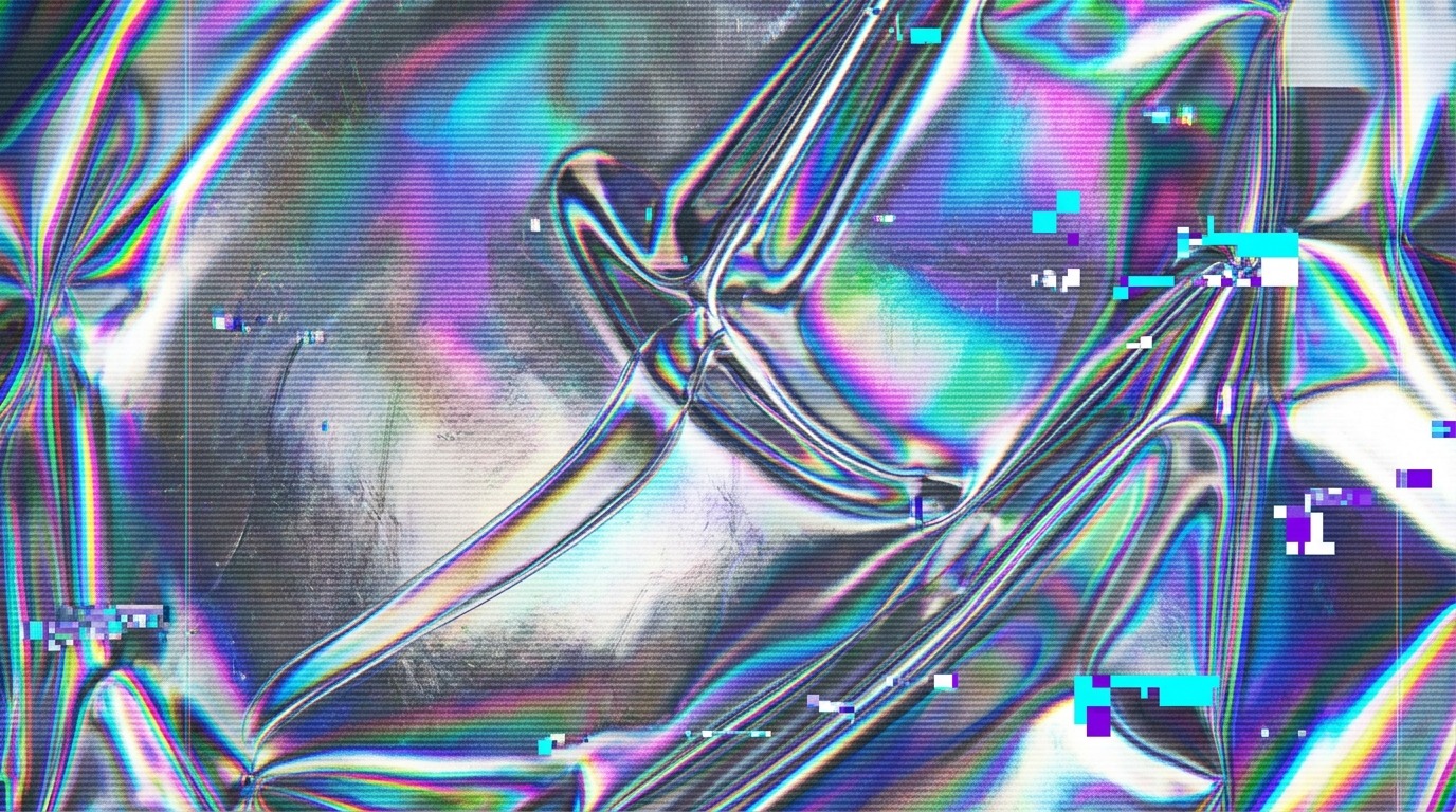
Y2k style is not just about objects. It is about how the image itself looks. The digital texture of the early internet era is a defining characteristic. Low resolution. JPEG compression artifacts. Scan lines. Pixelation. These are not flaws in a y2k prompt. They are features.
The term “digital texture” covers several specific visual elements. CRT monitor scan lines create horizontal bands across the image. VHS tracking noise produces horizontal bands of static. JPEG compression creates blocky 8×8 pixel artifacts in areas of flat color. Web-safe color palettes limit the color range to 216 specific hues. Each of these can be prompted individually.
A direct prompt for CRT texture: “CRT monitor screen with visible RGB scan lines, slight screen glare, curved glass edges, 800×600 resolution, desktop icons visible, Windows 98 taskbar.” This gives the AI a specific reference point. It will render the scan lines and the interface elements together.
For JPEG compression artifacts, use: “Heavy JPEG compression artifacts, blocky color banding in gradients, pixelated edges, low resolution, 72 dpi, early web jpeg quality.” The phrase “early web jpeg quality” is surprisingly effective. It anchors the AI in the specific degradation pattern of late-1990s image sharing.
VHS texture requires motion context even in a still image. “VHS tracking noise, horizontal static bands, slightly distorted geometry, faded color saturation, magnetic tape grain.” The AI will apply a subtle distortion that mimics analog video decay.
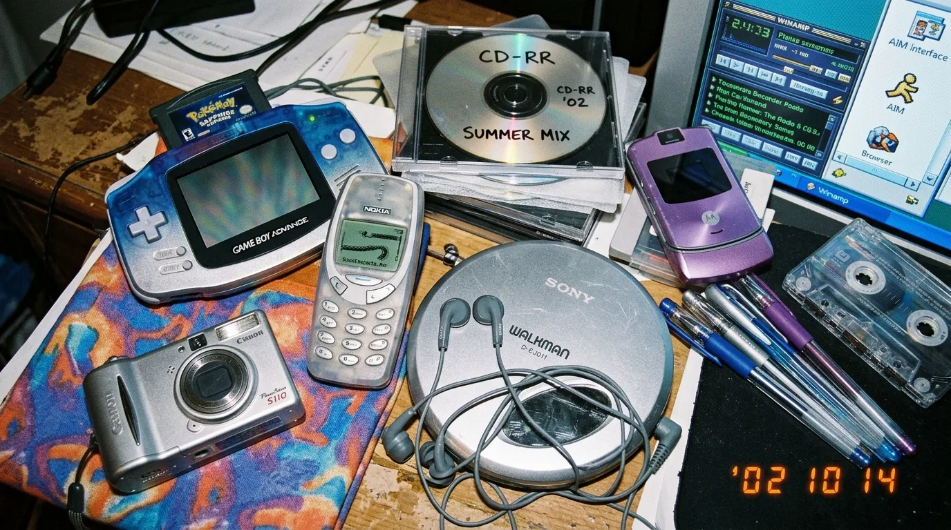
The challenge with digital texture prompts is overdoing it. Too many artifacts and the image becomes unreadable. Our rule of thumb is to apply one texture type per image. CRT scan lines OR JPEG compression, not both. Stacking textures creates visual noise that breaks the illusion. You want the image to look like it was shot in 1999, not like it was run through a glitch filter in 2026.
🎬 AI Render Pro Studio, the AI film production suite I built and use on my own productions. Script breakdown, storyboards, 30+ video models including Seedance 2.5 and Kling O3, image generation, retouch, 7K upscaling and audio, all in one browser workspace. $19/month flat, bring your own API keys and pay providers at cost, no credit packs, no markup. Try AI Render Pro Studio →
For consistent texture across a series, use the same texture keyword in every prompt. If you choose “CRT scan lines” for image one, use it for images two through ten. Consistency is what makes a set of images feel like a coherent project rather than a random collection of retro experiments. You can see this approach applied in the 20 essential y2k prompts we compiled for rapid iteration.
Lighting: The Overhead Fluorescent and Direct Flash
Lighting is the fastest way to sell or kill a y2k style image. The era had a very specific lighting signature. Overhead fluorescent tubes in offices and schools. Direct on-camera flash at parties and family gatherings. Harsh, unflattering, and flat. That is the look you want.
Overhead fluorescent lighting creates even, shadowless illumination with a green or blue color cast. It flattens faces and objects, removing the dramatic shadows that modern cinematography prizes. In prompt terms: “Overhead fluorescent lighting, cool white color temperature, even illumination, minimal shadows, institutional setting.”
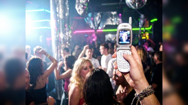
Direct on-camera flash is the other dominant y2k light source. It produces a bright, centered hotspot with rapid falloff into darkness. Red-eye is common. Backgrounds go black. The subject is harshly lit with no diffusion. Prompt: “Direct on-camera flash, harsh frontal lighting, bright white flash, dark background falloff, red-eye effect, snapshot photography style.”
Combine both for an indoor scene. A room lit by overhead fluorescents with a camera flash as the key light creates the unmistakable y2k party or school photo look. The two light sources clash in color temperature, which the AI renders as a mixed white balance that looks authentically amateur.
Avoid soft lighting keywords. No “softbox,” “diffused,” “golden hour,” or “rim light.” These are modern production terms that pull the image out of the y2k period. If you need a softer look, use “overcast window light” which was common in y2k-era home photography but still retains the flat, unglamorous quality.
For outdoor scenes, the y2k look is high-contrast sunlight with deep shadows and blown-out highlights. Early digital cameras had poor dynamic range, so skies would clip to white and shadows would block up to black. Prompt: “Bright midday sun, high contrast, blown-out sky, deep black shadows, low dynamic range, early digital camera.”
One lighting detail that matters for product shots is the use of a light tent or diffusion panel. Y2k product photography often used soft, even light, but it was not the soft light of modern beauty photography. It was the even light of a budget light box with two fluorescent tubes. The result is flat but not soft. Prompt: “Even product lighting, two fluorescent tubes, light tent, flat illumination, no specular highlights, catalog photography.”
Olivier notes that lighting is the most common failure point in client work. “People prompt the objects right but forget the light. Then the image looks like a modern object with a retro filter. The light has to be wrong. Deliberately wrong.” That advice has saved many a shoot in our studio.
Composition and Framing for Era Accuracy
Composition in y2k style is not about the rule of thirds or leading lines. It is about the compositional habits of amateur photographers in the early 2000s. Centered subjects. Cropped-off heads. Cluttered backgrounds. Awkward angles. These are your tools.
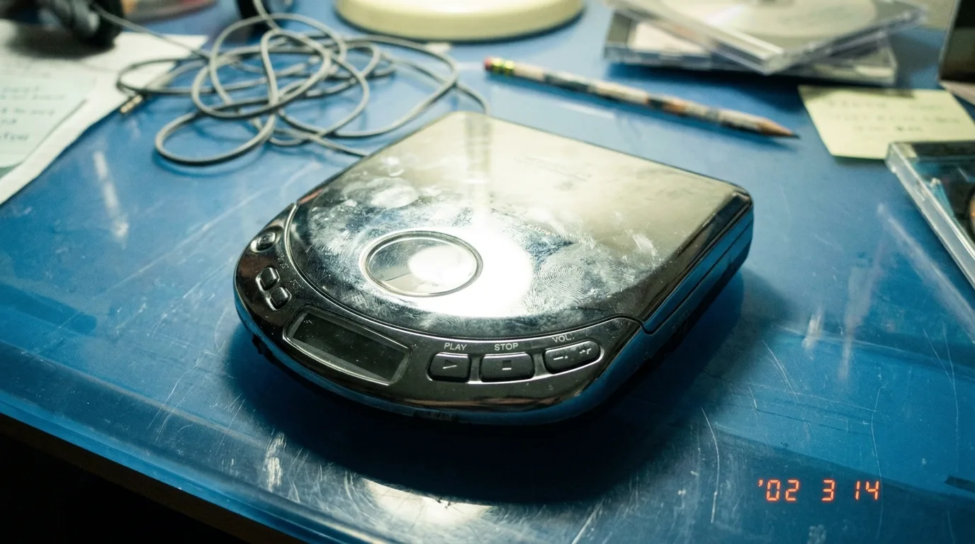
The most common y2k composition is the centered subject with generous headroom. The person or object sits dead center in the frame with a large empty space above them. This was the default composition of point-and-shoot cameras with optical viewfinders that did not show the full frame. Prompt: “Centered composition, subject in middle of frame, large empty space above head, point-and-shoot camera, accidental framing.”
Cropped-off body parts are another hallmark. Feet cut off at the ankle. Hands cut off at the wrist. The top of someone’s head missing. These framing errors happened constantly because viewfinders showed less than the final image. Prompt: “Feet cropped out of frame, awkward framing, unintended crop, snapshot aesthetic, family photo style.”
Cluttered backgrounds are essential. Y2k photos were not staged. Desks had papers, cables, and coffee cups. Bedrooms had posters, laundry, and clutter. The background is as important as the subject. Prompt: “Cluttered desk background, papers, cables, coffee cup, messy bedroom, lived-in space, documentary style.”
Angles matter. The most y2k angle is the slightly downward tilt from standing height, as if the photographer was holding the camera at chest level and pointing down. This angle was common because early digital cameras had no articulating screens. You framed by looking through a tiny viewfinder or an LCD that was unusable in bright light. Prompt: “Slightly high angle, shot from chest height, downward tilt, casual snapshot, amateur photography.”
For product shots, the flat lay was already common in y2k but not the curated flat lay of Instagram. It was a functional flat lay. Items placed on a desk or table with no styling. Cables visible. Price tags still attached. The composition was practical, not aesthetic. Prompt: “Flat lay on wooden desk, functional arrangement, cables visible, no styling, product documentation style.”
Avoid modern composition keywords like “cinematic,” “dutch angle,” “symmetrical,” or “leading lines.” These signal intentionality. Y2k composition is defined by its lack of intentionality. The image looks like it was taken quickly, without thought, and printed without editing. That is the quality you are replicating.
Prompt Structure: The Five-Element Formula
After hundreds of tests across FLUX.2, Midjourney, and Nano Banana, we have settled on a five-element prompt structure that reliably produces y2k style results. Each element serves a specific function. Missing one creates a gap that the AI fills with modern defaults.
Element one is the subject. A specific object or person. “A teenager holding a silver flip phone.” “A desk with a translucent blue iMac G3.” “A woman wearing a metallic halter top.” Be concrete. The AI cannot guess what you mean by “y2k scene.” Give it a noun and a descriptor.
Element two is the material or texture. Chrome, translucent plastic, denim, velour, metallic fabric, frosted polycarbonate. This is where you set the tactile quality of the image. “Chrome finish, translucent green plastic casing, velour track suit fabric.”
Element three is the lighting. Overhead fluorescent, direct flash, midday sun, light tent. This is the most commonly skipped element and the one that most determines authenticity. “Overhead fluorescent lighting, cool white color temperature.”
Element four is the composition and framing. Centered, cropped, cluttered background, high angle. This controls the visual structure. “Centered composition, feet cropped out, cluttered bedroom background.”
Element five is the camera and format. “Shot on a 2-megapixel digital camera, 640×480 resolution, JPEG compression, 72 dpi.” This final element locks in the technical limitations of the era. Without it, the AI defaults to modern image quality.
A complete prompt using all five elements: “A teenager holding a silver flip phone, chrome finish, translucent blue keypad, direct on-camera flash, centered composition with large headroom, cluttered bedroom background, shot on a 2-megapixel digital camera, heavy JPEG compression.”
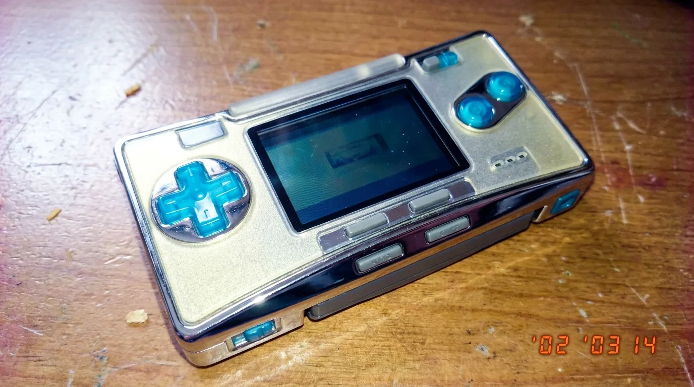
This structure works across tools. In Midjourney, you can add style parameters like “–s 50 –v 6.1” to reduce stylization. In FLUX.2, you can add negative prompts like “modern, sharp, clean, cinematic.” In Nano Banana, you can use the AI Render Pro tool to batch test variations of the five elements quickly.
Our testing shows that dropping any one element reduces the y2k authenticity score by roughly 20 percent. The lighting element is the most critical. A prompt with perfect subject and materials but modern lighting will look like a modern object with a retro filter. The lighting element alone can save or sink the image.
Tool-Specific Workflow for FLUX and Midjourney
Different AI tools require different approaches to y2k style. FLUX.2 excels at photorealistic texture and material rendering. Midjourney is better at composition and atmosphere. Nano Banana offers the fastest iteration for prompt testing. Knowing which tool to use for which job saves hours of frustration.
For FLUX.2, the key is specificity in material keywords. FLUX understands optical properties well. “Chrome” produces a metallic reflection. “Translucent polycarbonate” produces a plastic light scatter. “Velour” produces a fabric nap. Use precise material language and FLUX will render it correctly. Avoid abstract terms like “retro vibe” or “old school.” FLUX needs concrete nouns.
FLUX also handles lighting prompts better than any other tool. “Overhead fluorescent” produces a green-tinted flat light. “Direct flash” produces a harsh hotspot with dark falloff. You can even prompt specific color temperatures. “3200K tungsten” or “5500K daylight.” FLUX respects these values.
For Midjourney, the style parameter is your best friend. Use “–s 50” or lower to reduce the default stylization that makes everything look like a fantasy illustration. For y2k, you want “–s 30 –v 6.1” to keep the image grounded in reality. Higher stylization values add artistic flourishes that break the amateur snapshot illusion.
Midjourney also responds well to negative prompts. Add “–no modern, cinematic, sharp, clean, polished, HDR” to remove the default high-quality rendering. Midjourney’s default output is too good for y2k. You have to deliberately degrade it.
Nano Banana is the tool for rapid iteration. Its speed allows you to test the five-element formula with variations. Swap the subject. Change the color. Adjust the lighting. Generate twenty variations in the time it takes to generate four in Midjourney. Use Nano Banana for exploration and FLUX for final output.
Our studio workflow is: explore in Nano Banana, refine in Midjourney, finalize in FLUX.2. This pipeline gives us the speed of exploration with the quality of final rendering. Each tool plays to its strength. You can see this workflow applied in the cinematic AI art direction guide we published for professional realism.
Common Errors and How to Fix Them
Even with the right prompt structure, y2k style images fail in predictable ways. Here are the five most common errors we see in studio reviews and how to fix each one.
Error one is modern materials. The AI renders a plastic object that looks like 2026 injection molding instead of 1999 vacuum forming. The fix is adding “cheap plastic, visible mold lines, rough edges” to the material element. Y2k plastic was not precision engineered. It had seams, flash, and uneven thickness.
Error two is clean backgrounds. The AI creates a minimalist desk with one object on it. The fix is adding “cluttered background, papers, cables, coffee stains, sticky notes.” Y2k environments were messy. The clutter is part of the aesthetic.
Error three is perfect skin. The AI renders faces with smooth, even skin tone and no imperfections. The fix is adding “visible skin texture, slight blemishes, uneven skin tone, no makeup, natural lighting.” Y2k photography did not use beauty retouching. Skin looked like skin.
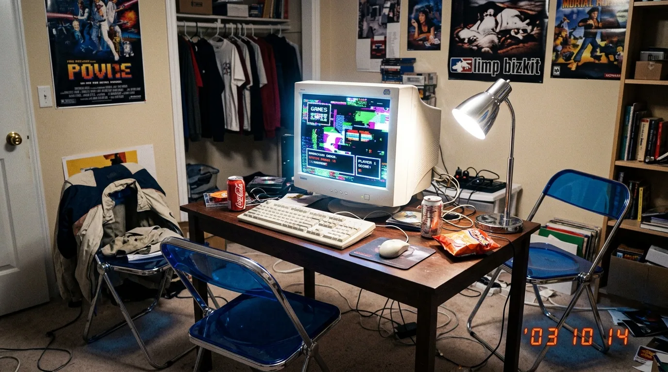
Error four is modern color grading. The AI applies a teal-and-orange color grade that looks like a 2026 blockbuster. The fix is adding “flat color profile, no color grading, neutral white balance, slightly green color cast.” The color should look unprocessed, like a JPEG straight out of a camera.
Error five is excessive sharpness. The AI renders every detail in crisp focus. The fix is adding “soft focus, slight motion blur, low resolution, 640×480, 72 dpi.” Y2k digital cameras had soft lenses and low resolution. Sharpness is a modern luxury.
Each error has a corresponding prompt fix. If you see modern materials, add material degradation keywords. If you see clean backgrounds, add clutter. The five-element formula gives you a diagnostic framework. Identify which element is failing and adjust that element specifically.
Olivier recommends a two-pass review process. “First pass, check the lighting. Second pass, check the texture. If both are right, the image will read as y2k even if the subject is wrong. If either is wrong, the image fails regardless of the subject.” This heuristic has saved countless iterations in our studio.
Production Use Cases for Brands and Campaigns
Y2k style is not just for personal projects. Brands are actively requesting this aesthetic for campaigns in 2026. Fashion labels want lookbooks that feel like 1999 magazine spreads. Tech companies want product shots that evoke the early internet era. Music videos want the grainy, flash-lit party aesthetic.
For fashion campaigns, the key is balancing y2k texture with modern production value. You want the lighting and materials of 1999 but the composition and model direction of 2026. A workable prompt: “Model wearing metallic silver halter top and low-rise denim, direct on-camera flash, centered composition, cluttered bedroom background, shot on 35mm film with flash, fashion editorial style.” The “fashion editorial style” at the end pulls the image toward a professional look while the rest anchors it in y2k.
For tech product launches, the y2k aesthetic signals nostalgia and authenticity. A prompt for a modern smartphone in y2k style: “Modern smartphone on translucent blue polycarbonate desk, chrome accents, overhead fluorescent lighting, flat lay composition, product catalog style, shot on 2-megapixel digital camera.” The contrast between the modern product and the vintage treatment creates a compelling visual tension.
For music videos, y2k style is about energy and imperfection. Party scenes with direct flash. Handheld camera movement. Blurry subjects. Overexposed highlights. Prompt: “Party scene with teenagers, direct on-camera flash, motion blur, overexposed faces, dark background, handheld camera, VHS grain, music video style.”
Our studio has used this approach for client work across fashion, tech, and entertainment. The consistency comes from the five-element formula. Every image in a campaign starts from the same structural template, with variations only in the subject and color palette. The result is a cohesive set that feels like a single photoshoot from 1999.
For readers interested in exploring further, the retro prompts collection offers additional templates for nostalgia-driven projects. The key is to treat y2k not as a filter applied after the fact but as a production system built into the prompt from the start.
Advanced Technique: Mixing Eras Without Breaking the Illusion
Once you have mastered pure y2k style, you can start mixing eras. A modern subject in a y2k environment. A y2k object in a contemporary setting. A 1999 camera rendering a 2026 scene. These hybrid images create a temporal dissonance that is visually interesting and conceptually rich.
The technique is simple. Pick one element from the five-element formula and make it modern while keeping the other four in y2k. For example, a modern smartphone (subject) with y2k lighting, texture, composition, and camera format. The result is a contemporary object seen through a 1999 lens. It feels familiar and alien at the same time.
Another hybrid: a y2k object (a silver flip phone) in a modern environment (a minimalist apartment with smart home devices). The lighting and camera format stay y2k, but the background introduces contemporary details. The flip phone looks like a relic, but the lighting makes it feel present.
For character design, you can mix y2k fashion with modern styling. A model wearing a metallic halter top and low-rise jeans but with a 2026 haircut and makeup. The clothing anchors the image in y2k while the styling pulls it forward. This is a common approach in fashion editorials that reference the era without copying it exactly.
The risk of mixing eras is breaking the illusion entirely. If the hybrid is too balanced between eras, it looks like neither. The rule is to commit 80 percent to one era and 20 percent to the other. The dominant era determines the lighting, texture, and camera format. The minority era affects only the subject or background.
This technique is particularly useful for brands that want to reference y2k without looking dated. A luxury watch brand, for example, can use y2k lighting and texture for a campaign while keeping the product and styling firmly modern. The result is nostalgic without being retro. You can see examples of this approach in the AI personas guide for character design across eras.
Olivier describes hybrid prompting as “the most fun you can have with a text box.” It forces you to think about which visual elements define an era and which are interchangeable. The exercise sharpens your understanding of both y2k and contemporary aesthetics.
Every AI image in this article was generated with AI Render Pro, the prompting engine I built for filmmakers and creatives. Read the full breakdown here.
Frequently Asked Questions
What is the single most important keyword for y2k style prompts?
The most important keyword is “direct on-camera flash.” No other lighting condition creates the unmistakable y2k snapshot look. Without it, your image risks looking like a modern scene with retro objects. With it, even a contemporary subject reads as period-accurate.
Can I use y2k style prompts for video generation?
Yes. The same five-element formula applies to video prompts. Add motion keywords like “handheld camera movement,” “VHS tracking noise,” and “low frame rate, 15 fps” to match the era’s video quality. Tools like Runway and Pika support these parameters.
How do I avoid the AI making objects look too modern?
Add material degradation keywords to every prompt. “Visible mold lines, rough plastic edges, cheap finish, uneven paint.” These signal to the AI that the objects are mass-produced consumer goods from a period before precision manufacturing became standard.
What color palette defines y2k style?
The core palette includes Bondi Blue, Atomic Purple, Ice Gray, Lime Green, Silver Chrome, and Metallic Silver. Avoid pastels and earth tones. Y2k colors are saturated, slightly harsh, and often clashing. Think primary colors mixed with metallics.
Is y2k style still relevant in 2026?
More relevant than ever. The aesthetic has moved from niche nostalgia to mainstream production requirement. Brands, fashion houses, and music video directors regularly request y2k treatments. Mastering this style is a practical career skill for any visual creator in 2026.
Discover more from Olivier Hero Dressen Blog: Filmmaking & Creative Tech
Subscribe to get the latest posts sent to your email.

Work with Olivier
Director | CD | DP & Photographer
Specializing in commercials, music videos, AI-driven filmmaking, and cinematic storytelling for brands and production companies.
🌍 Shanghai · Paris · Los Angeles · Dubai
🎬 View Portfolio & Get in Touch